Connection Map
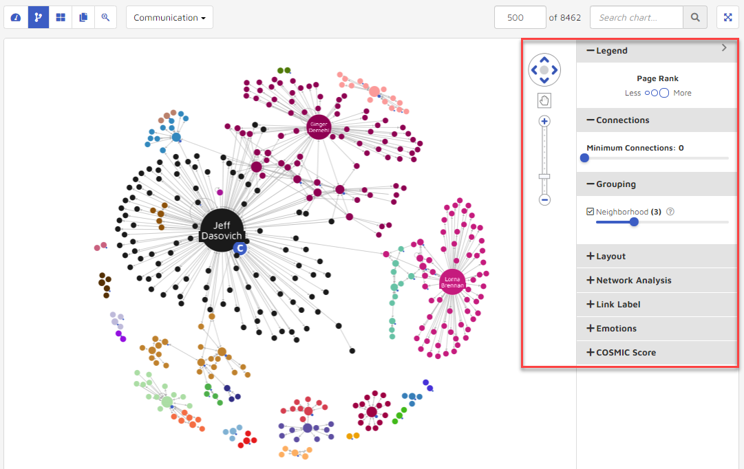
Connection Map is used to draw communication relationships between different people. The visualization shows a person’s name, with whom he/she communicates, and how many times they communicate. To the right of the map are tools for navigation and, by clicking on the arrow to the right, various tools for modulation. See highlighted area below:
1. Navigation control
The Navigation Control lets users move, zoom in/out or drag the visualization.
Click the
 icon to move the visualization up, down, left or right.
Click the
 or
or  icon to switch between sticky mode and click mode. In sticky mode, a user can drag around the entire visualization or any element. In click mode you can draw a box around multiple elements and then drag them as a group.
Click the
 and
and  icon on the zoom bar to zoom in and zoom out of the visualization.
Clicking the arrow on the right side of the screen will expand a Settings panel to modify how users can visualize their data. Options include a legend, connections, grouping, layout, network analysis, link label, emotions and COSMIC score.
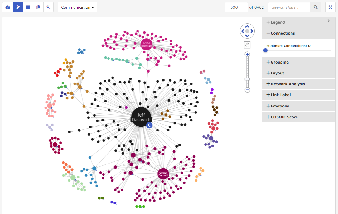
2. Connections
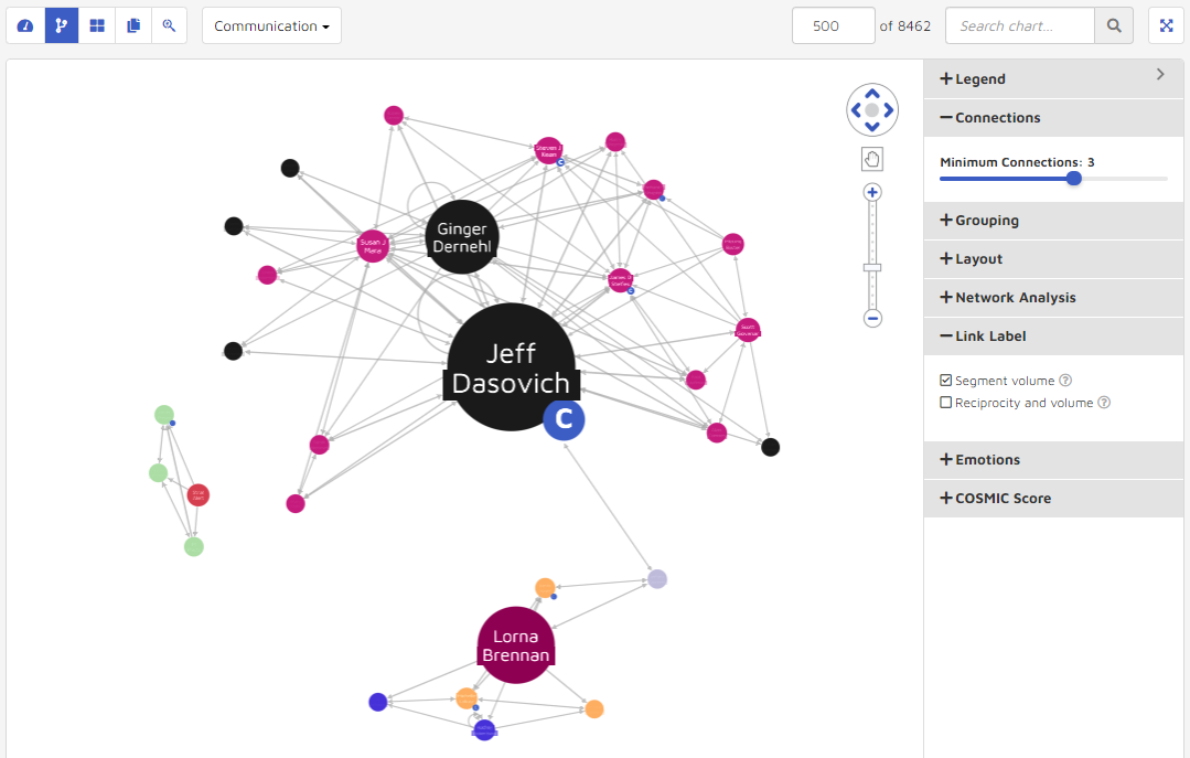
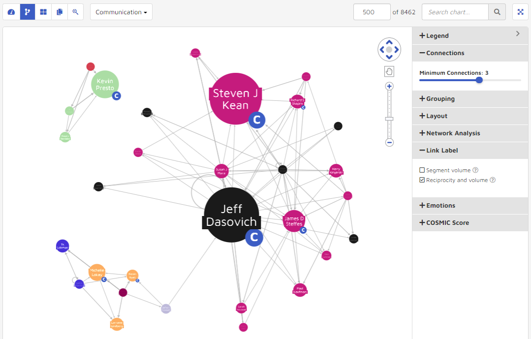
One way to adjust visualization and reduce clutter is by using minimum connections. The connections function calculates a graph where each node has a desired number of connections. A user can use the Minimum Connections slide bar to specify the connections values desired.
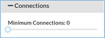
For example, the following graphic shows the visualization before and after changing the connections value from 1 to 5.
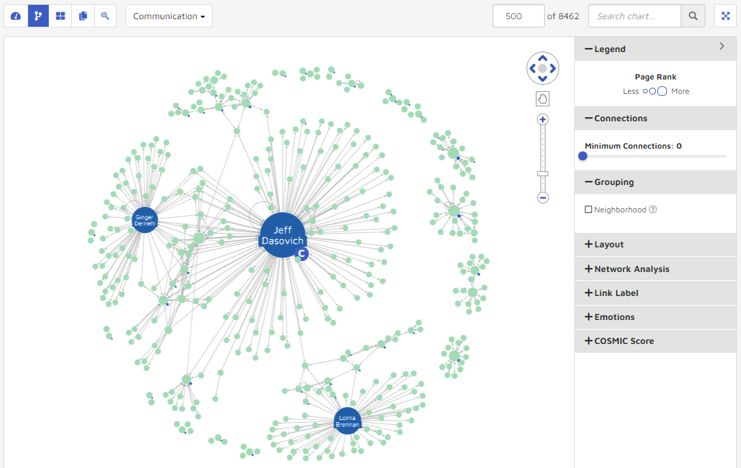
3. Grouping
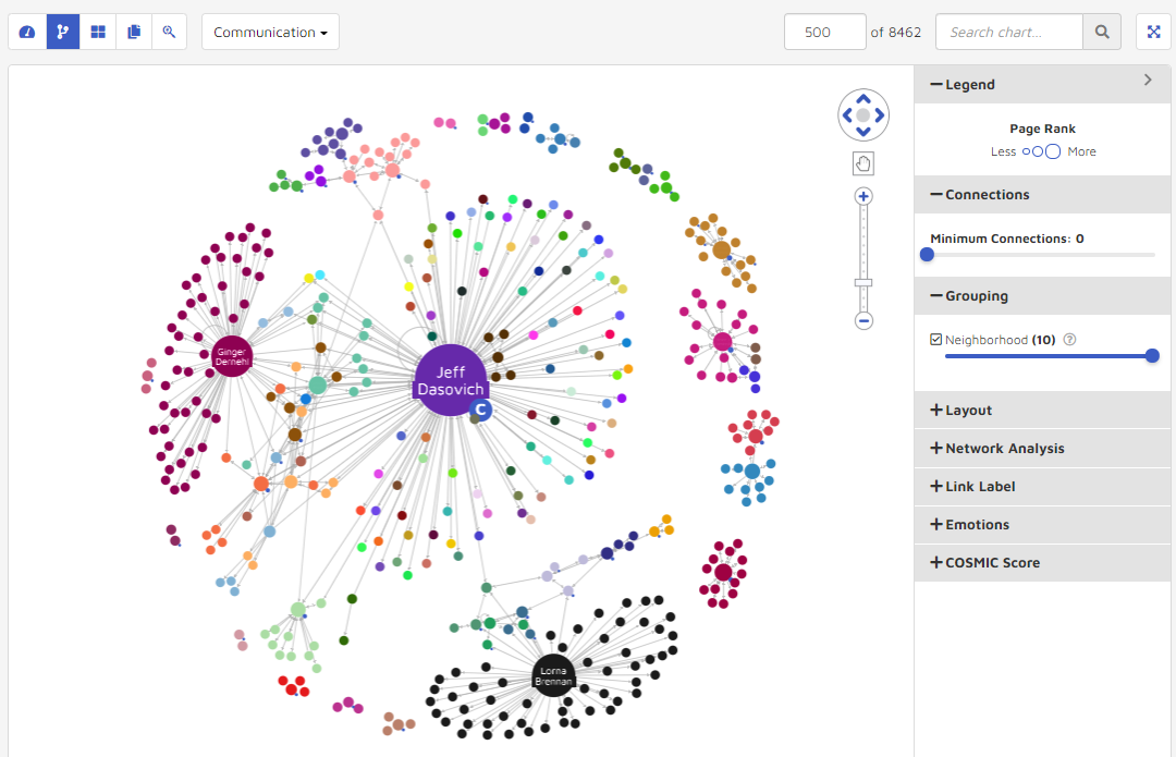
The grouping feature affects how nodes cluster within the data visualization. Higher values give smaller clusters, but more of them. Lower values give larger clusters, but not as many. The range is from 0 to 10. The following graphics show a change from having the setting turned off, to changing “Neighborhoods” to 10. The data visualization uses more colors when the neighborhood setting is higher.
Neighborhoods turned off.
Neighborhoods set to 10.
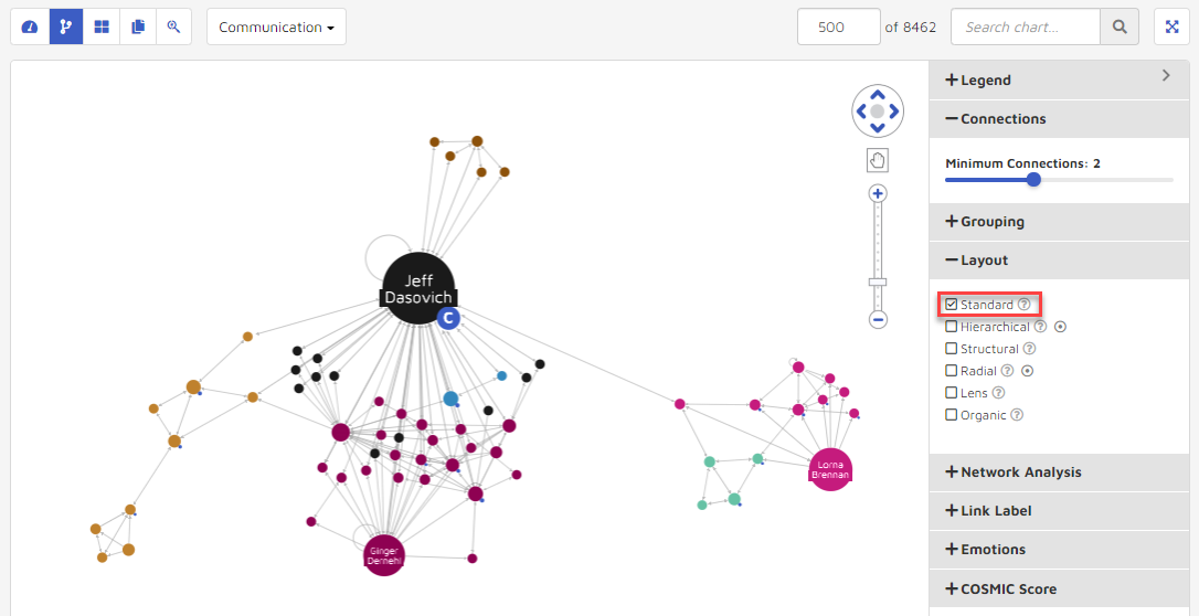
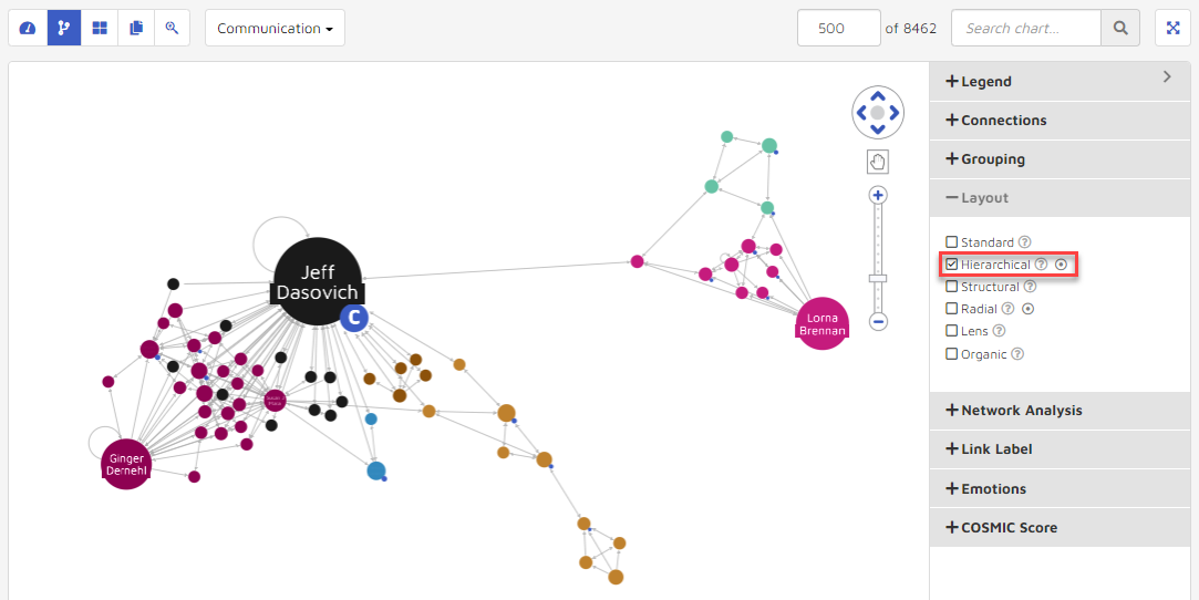
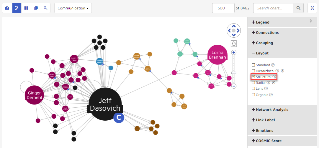
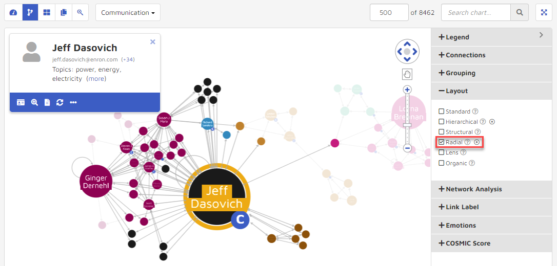
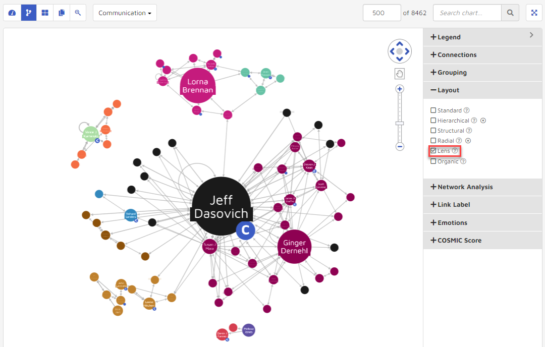
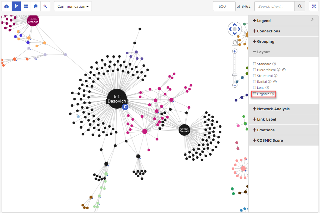
4. Layout
Layout determines the orientation of data visualized. By combining different combinations of Layout, Network Analysis, Grouping, etc., users can fully visualize and interrogate their data. Visualization arrangements support the following:
Standard: an efficient force-directed graph layout. Nodes and edges overlap as little as possible and are evenly spaced out.
Hierarchical: lays out nodes in a top down arrangement according to their connections. Like a family tree, children are shown below their parents in a top-down display. The dot to the right of the Hierarchical Layout selection notes that this option requires selected person nodes, which will be taken from the search criteria by default, or else may be selected from the Communication link using Ctrl-click.
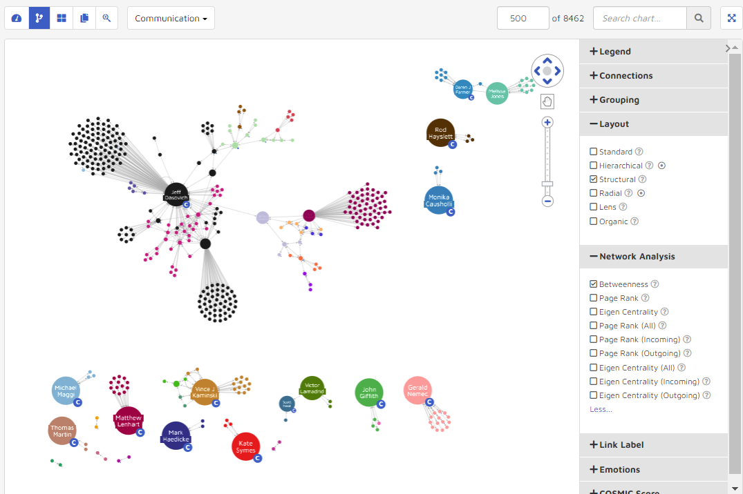
Structural: places nodes which are structurally similar together in the network. Similar nodes are grouped together in fans.
Radial: Nodes are arranged in circles around the original subject. The dot to the right of the Hierarchical Layout selection notes that this option requires selected person nodes, which will be taken from the search criteria by default, or else may be selected from the Communication link using Ctrl-click.
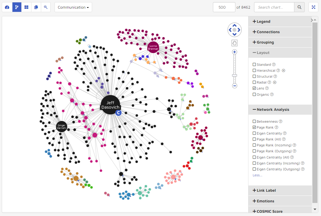
Lens: Highly connected nodes are pushed to center while less connected nodes are along the edge.
Organic: Untangles big networks and give a distinctive fan-like pattern to related groups of nodes.
5. Network Analysis
The Network Analysis settings are used to change how nodes within the data visualization are highlighted and oriented. Options include Betweenness, Page Rank (All, Incoming, Outgoing) and Eigen Centrality (All, Incoming, Outgoing). By hovering over the tool tip “question mark” icon users can see what will determine how the nodes are highlighted.
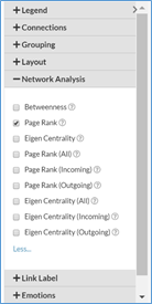
Betweenness: Highlights nodes with more connections between 2 or more other nodes.
Page Rank: Highlights nodes based on number of incoming links.
Eigen Centrality: Highlights nodes with influence by the number of links each person has and the number of links their connections have.
Page Rank (All): Highlights nodes based on number of links with communication count.
Page Rank (Incoming): Highlights nodes based on number of links with received emails.
Page Rank (Outgoing): Highlights nodes based on number of links with sent emails.
Eigen Centrality (All): Highlights nodes with influence by the number of links each person has received/sent and the number of links their connections have.
Eigen Centrality (Incoming): Highlights nodes with influence by the number of links each person has received and the number of links their connections have.
Eigen Centrality (Outgoing): Highlights nodes with influence by the number of links each person has sent and the number of links their connections have.
For example, the following graphic shows the data visualization before and after changing the Network Analysis value to Betweenness in Structural Layout compared to Page Rank Outgoing in Lens Layout.
6. Link Label
Link Label is used to annotate the inflow and outflow of messages to provide context for the communication patterns of 2 people.
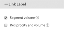
In Communication mode, a user can further show Segment Volumes (how many total emails entity A sent and received from entity B), or Reciprocity and Volume (number of emails entity A sent vs. number of emails entity A received).
Segment Volume
Reciprocity & Volume
Under the Reciprocity and Volume mode, the numbers on the links represent the ratio and the total emails. For example, the link between Jeff Dasovich and Steven J. Kean is “6.2(867)”, which means there are 867 emails overall between Jeff and Steven. For each 6.2 emails Jeff sent to Steven, Steven responded once.
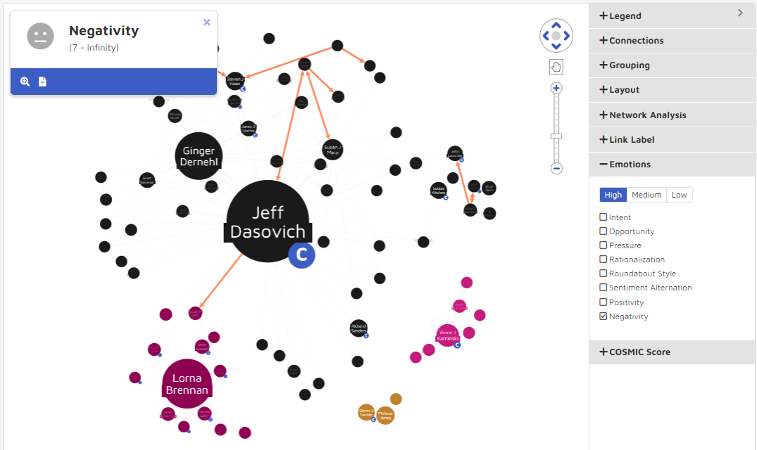
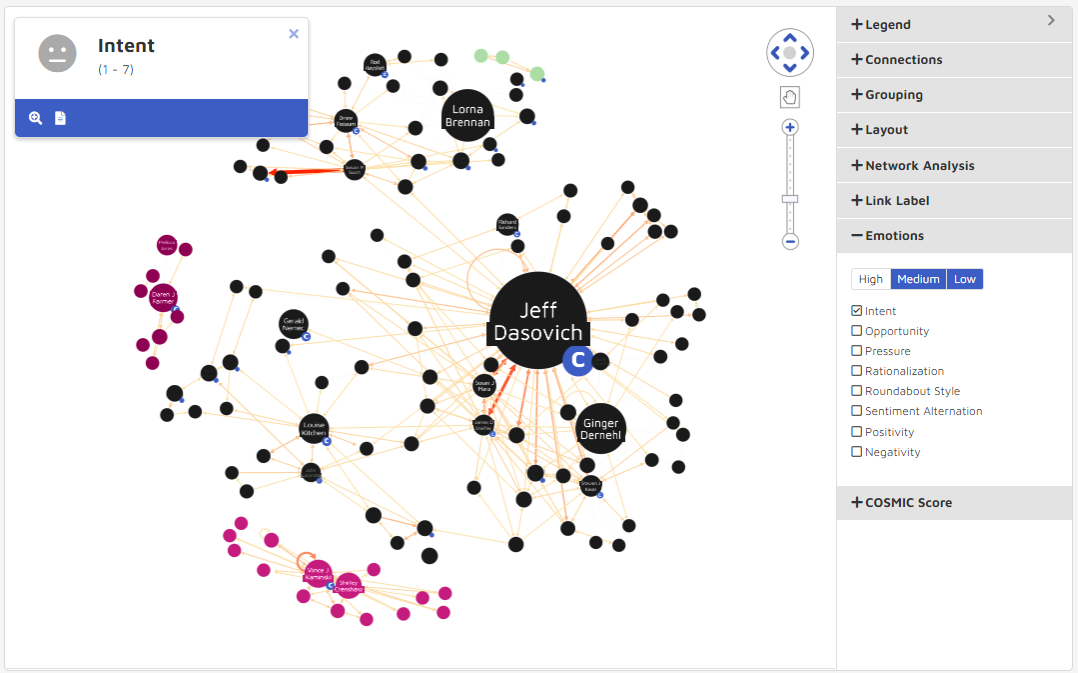
7. Emotions
In the settings panel users can overlay any emotional intelligence models to visualize communication patterns and find documents expressing specific sentiments. Using High, Medium and Low cutoff thresholds users can choose from Intent, Opportunity, Pressure, Rationalization, Roundabout Style (which may indicate evasiveness), Sentiment Alternation (which may be intentionally manipulative), Positivity and Negativity score filter conditions to be used separately.
The following graphic details the changes in visualization from a High Negativity setting to a Medium-Low Intent Score. Note that users can set a range for the High to Low, but may only choose one score setting at a time. The thickness of the line between connections is representative of the how strong the communication fit the emotions, so below, you can see the difference in communication patterns when switching between High Negativity and Low-Medium Intent scores.
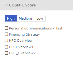
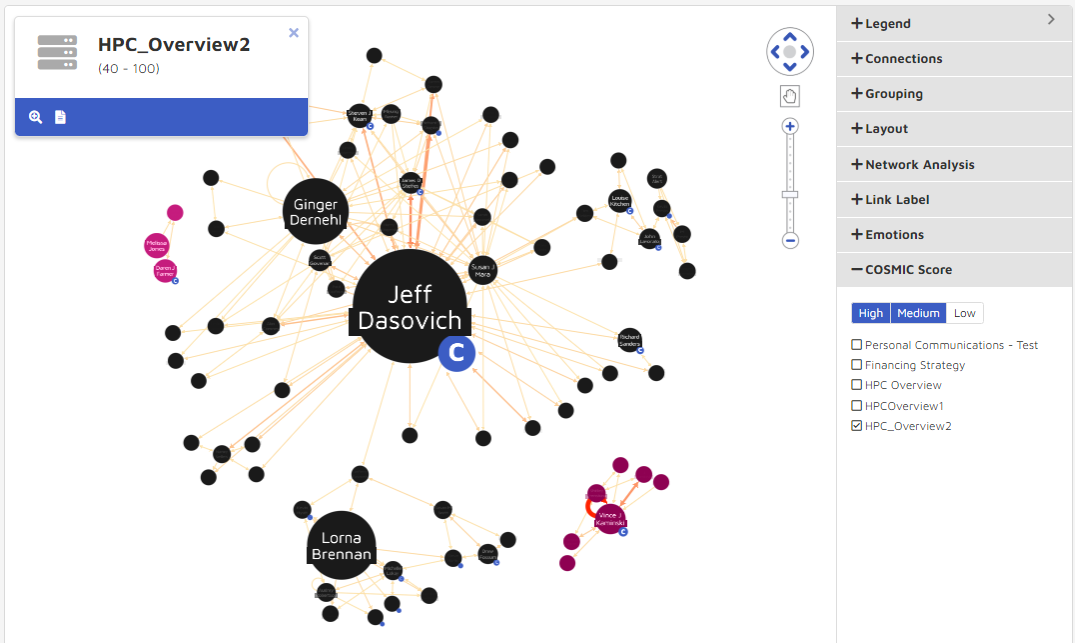
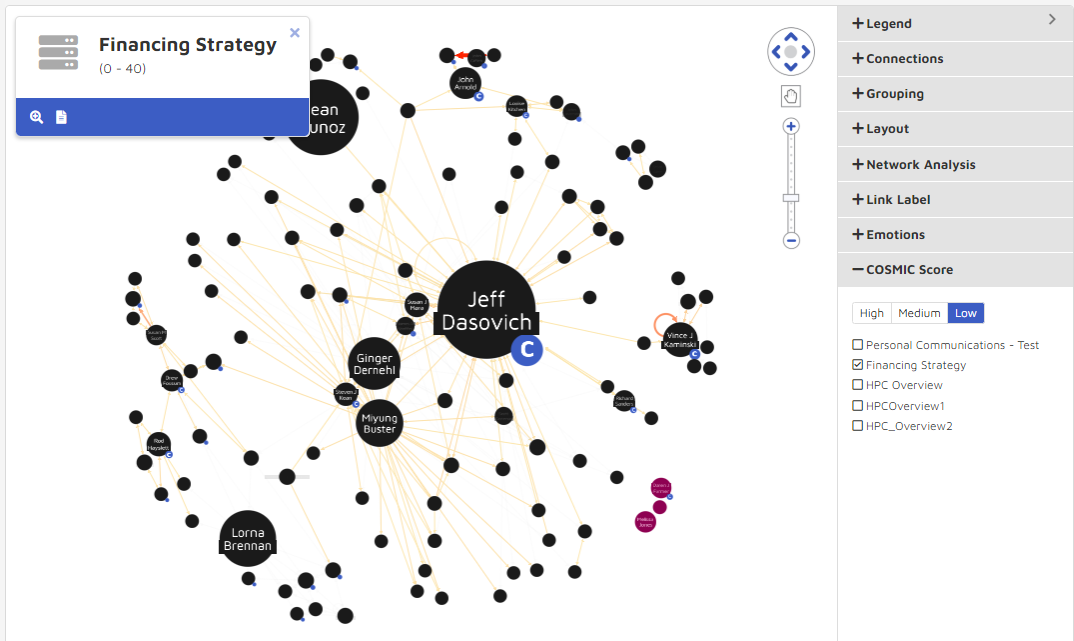
8. COSMIC Score
The COSMIC feature only works after COSMIC has been run at least once. A user selects from predefined High, Medium, or Low values for any COSMIC models that are a part of their storybook.
The graphic below shows the changes in visualization from an “HPC_Overview2” COSMIC model with only High and Medium documents compared to a “Financing Strategy” COSMIC model returning only low documents. Note that you can choose a range of thresholds, but only one model. The thickness of the line between connections represents how well the documents between the nodes fit the chosen COSMIC model.
9. Time Chart
The Time chart displays the visualization with time information. The time bar is located at the bottom of the visualization when a user selects this mode.
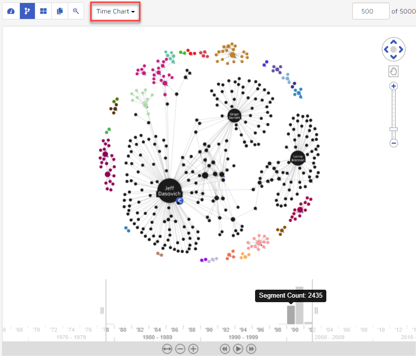
The time bar at the bottom represents the frequency of communications for each time period. A user can use their mouse scroll wheel to zoom in and zoom out the time period, or use the control buttons underneath to scroll, zoom, rewind, pause, go forward, expand or contract the time window to be evaluated. The visualization will update and reflect who has communications within the selected time range (between the two vertical lines on the time bar).
Double-click the link between the persons. Associated documents will open in the date range selected. For example, the graphic below shows the same data as above when zooming in to focus on Aug 22nd, 2001.
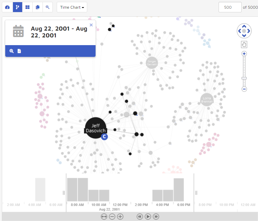
By clicking the Add to search button, users can return all threads that fall within time period. Users can then interrogate data from a specific time period more thoroughly. Clicking the View Documents button allows users to parse through the threads and documents in the thread viewer.
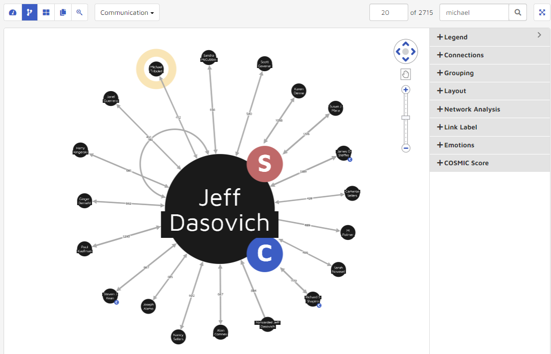
10. Maximum Connections and Search Chart Function
String search lets a user find entities in the visualization quickly when too many entities are loaded. For example, the following graphic shows “Michael Tribolet” when a user enters “Michael” then clicks the Search button:
Max Links: Lets a user specify how many pairs of relationships to load into the visualization. By default, the application loads the top 500 relationships. A user can increase or decrease the number by entering the desired number and then hitting Enter on their keyboard.
The application also gives you the total pairs of relationships the current data set represents.
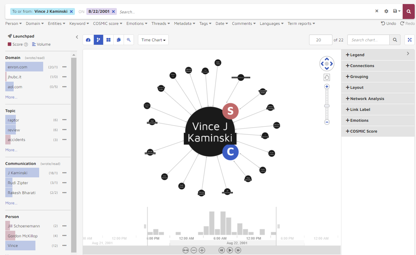
11. Glyphs
There are 2 glyphs used to represent the identity of the entities in the visualization:
S (selection): Indicates that person is part of the search criteria.
C (custodian): Indicates that person is a custodian.
Selection Indicator
 .
.Custodian Indicator
 .
.